Realise
Realise, which later became Kin + Carta, was the best source of work I had. They outsourced research and documents to us, and everything we did for them became a service line we then took to market. The office was one job inside that.
- Client
- Kin + Carta
- Timeframe
- 2010
Every office is making a claim about the work that happens in it. Realise's problem was that it had two claims to make and one building to make them in.
Realise was a client for a number of years. All manner of engagements. At Tiger Forest they were our number one client, and the best source of work I had. They outsourced research to us and documents to us, and everything we did for them, we then built a service line around it and then took that to the market. That is the relationship, and it is the reason the name matters more than any single project inside it.
The list of what came out of it is the evidence: brand consolidation, document production, microsites, printing, presentation development, logo development, UI work, and interior design across multiple offices. Each of those started as something Realise needed, and became something Tiger Forest sold.
Realise itself was a genuinely interesting company. It was almost perfectly split down the middle: an agency, and an extraordinarily high-end technical business building enterprise websites.
The agency was really the face of it. They made it cool, they made it recognisable, they made it a place people wanted to be. Don Smith was the creative director, a phenomenal talent. Fiona Proudler ran the agency side, and is quite well respected in the marketing scene in Scotland especially. The technical side did the heavy lifting. It drove revenues, it drove profit.
Realise was later acquired by St Ives, and its CEO went on to run the merged Amaze Realise.
So the brief was two briefs. The space had to have a vibrancy to it, for the agency. It had to have a current running through it. But the actual business itself was very grounded. It didn't have lavish parties. It was not buoyant. They had a fantastic vein of creativity, but real authenticity to it, and it was not about being big or loud or splashy. Whatever we did had to be clean enough to hold the engineering side as well.
It also had a shape problem. The business operated across two sides of a converted bonded warehouse, and over time those two sides had come to feel and look disconnected.
So we strove for a space without barriers.
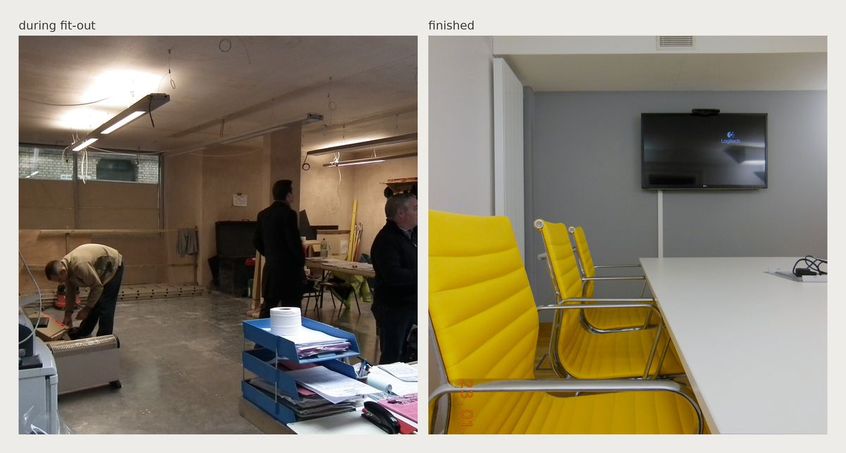
The clearest decision was the smallest one. We got rid of the big traditional formal reception desk and I moved it into the finance office, which structurally made space and actually brought the team together. The office manager wasn't sitting on their own in what amounted to a hallway.
Beyond that we lightened, brightened and opened up. The entrance became a beautiful double-height atrium.
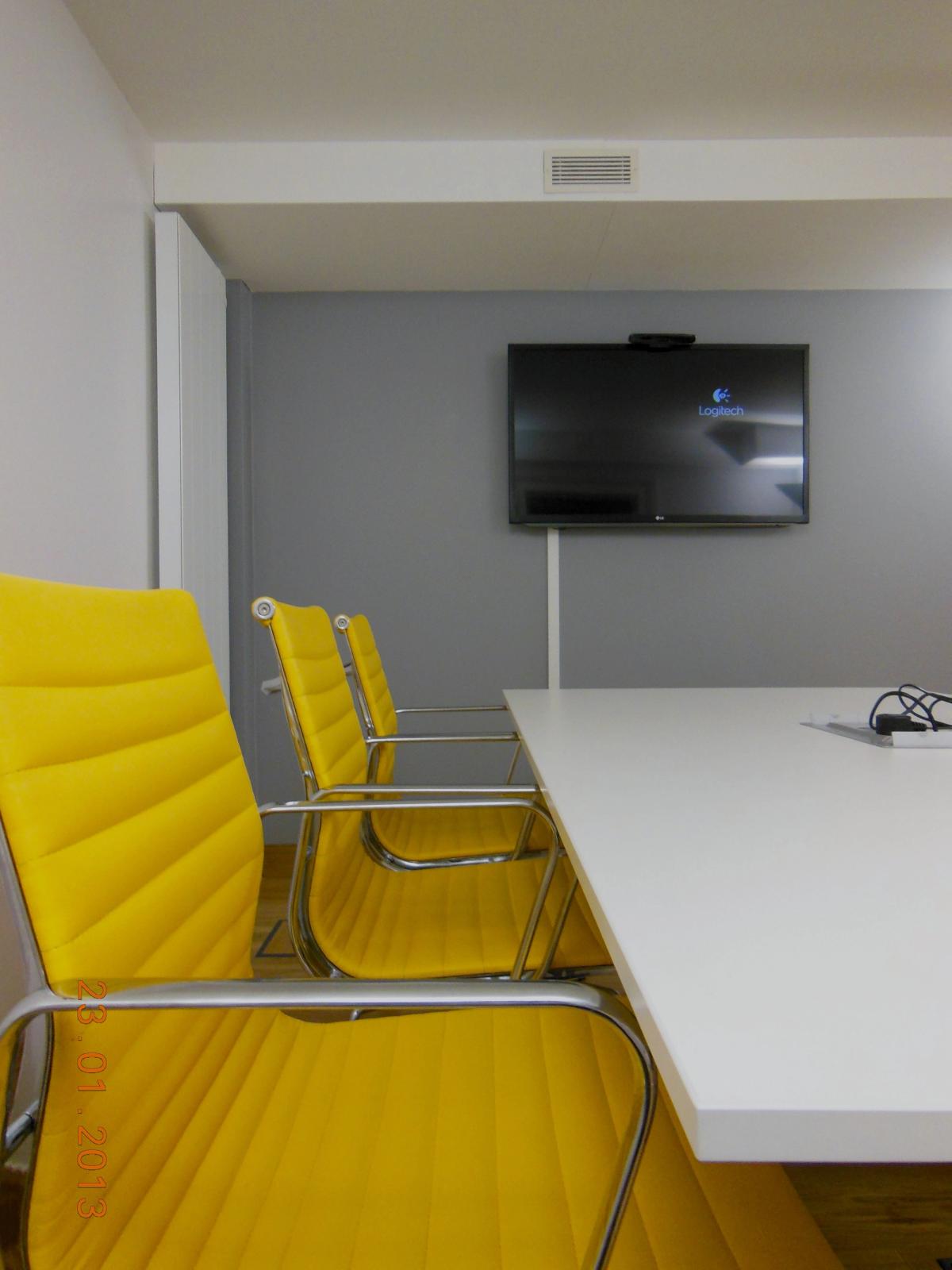
We did not use lots of different colours and fabrics, or make lots of breakout spaces. We had some. But the idea here was togetherness, openness, one brand across these two sides, so we used the accent colour very carefully and built a palette of white and warm neutrals underneath it.
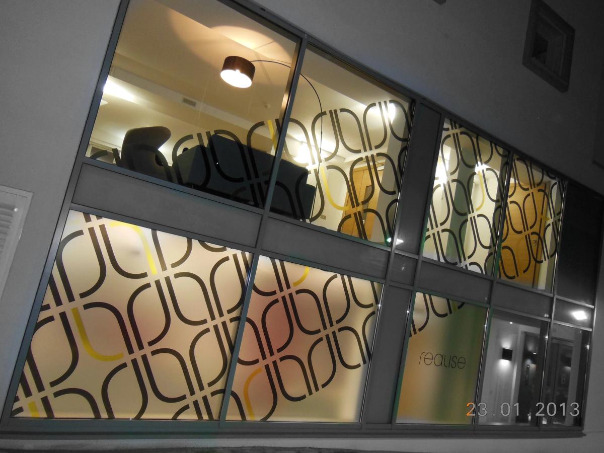
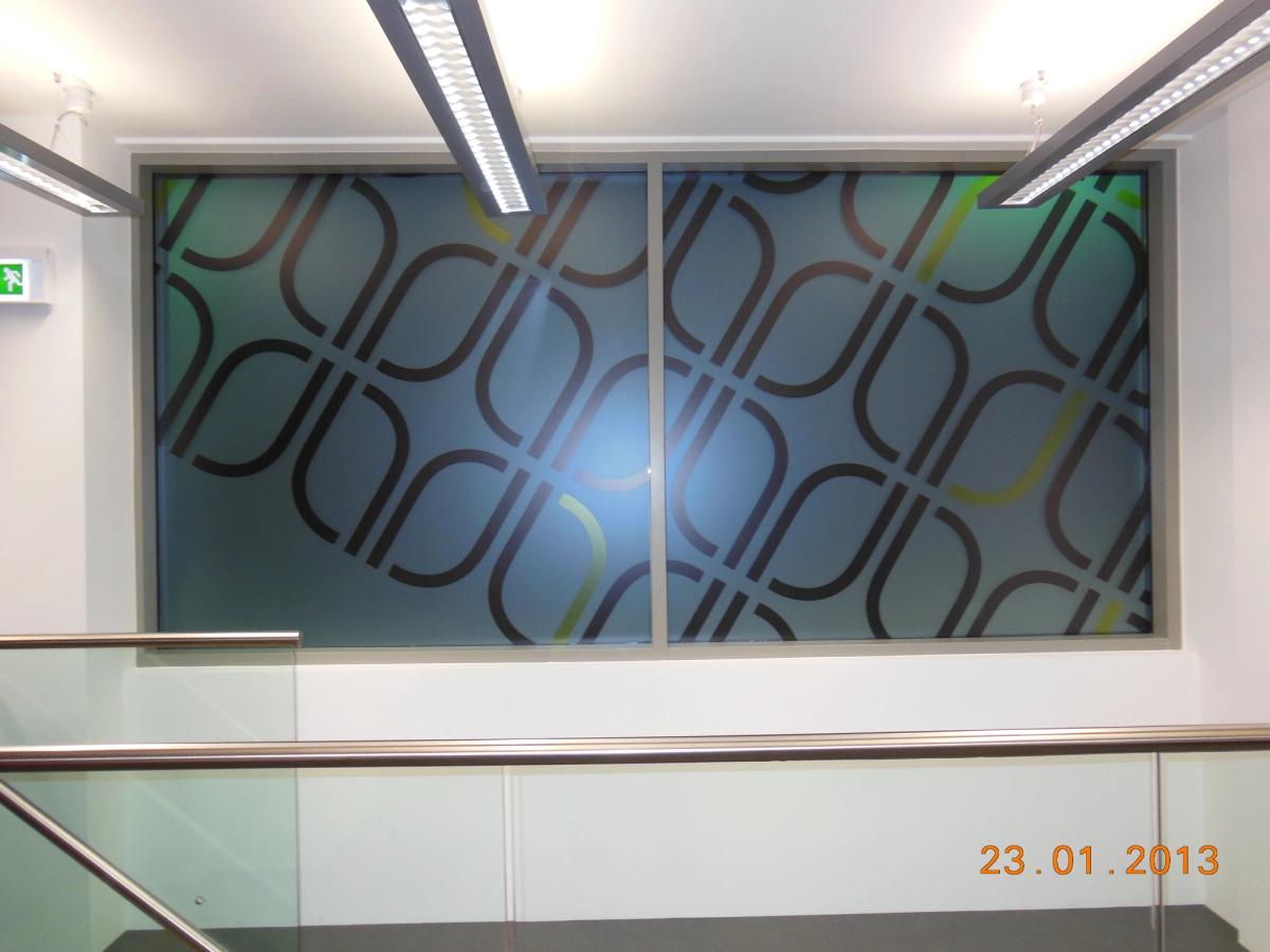
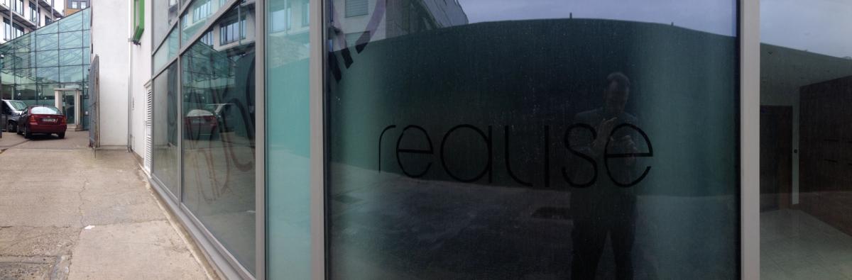
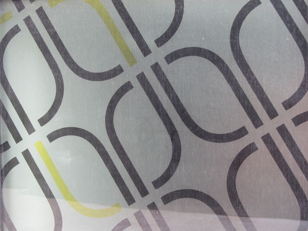
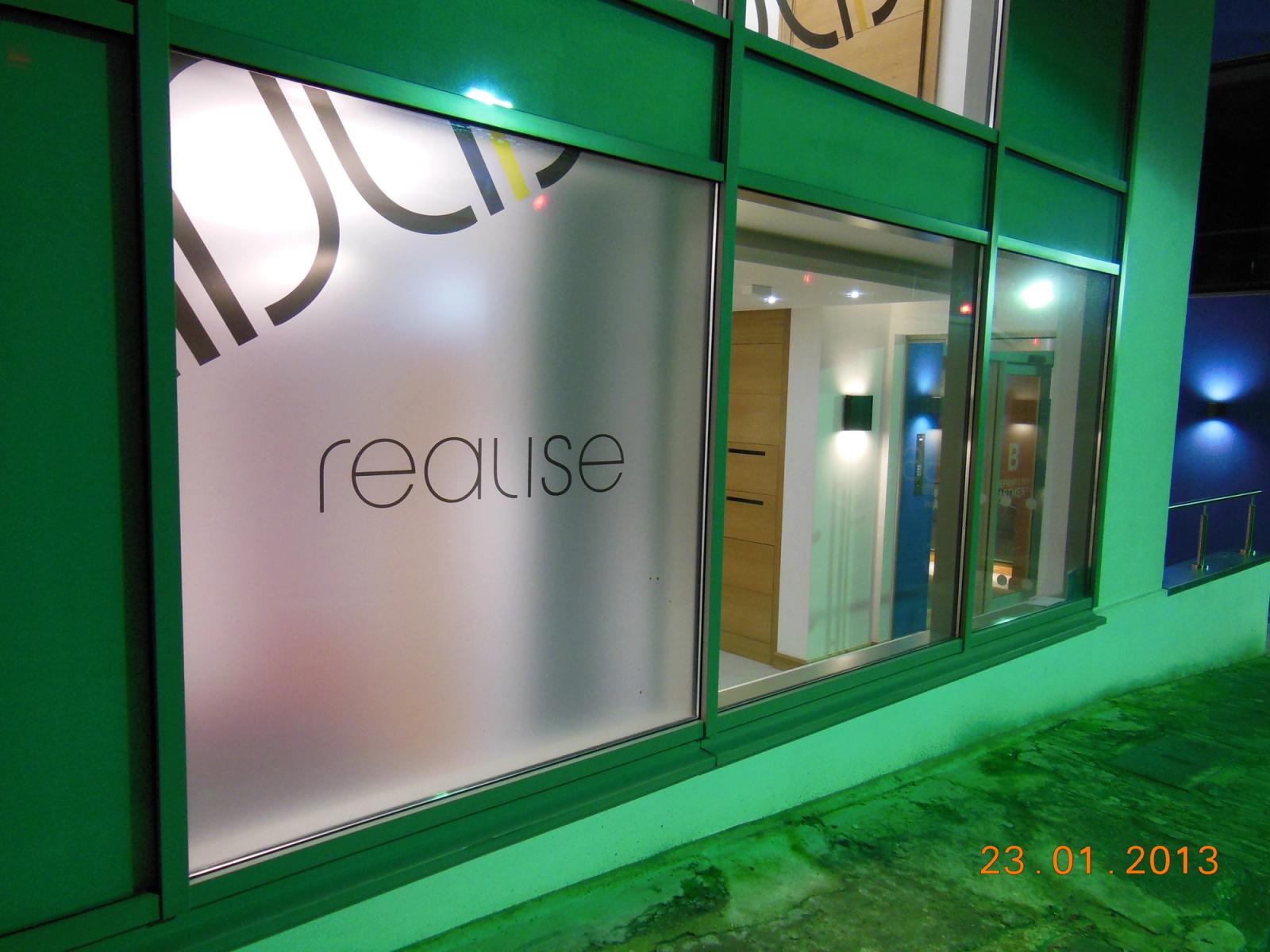
In London, on Turnmill Street, next to Adobe and a lot of other good brands, I designed the office's window vinyls. Realise only worked for enterprise, but the windows were good enough that they won business from their neighbours.
It was a place to come together to get meaningful work done, and be proud of it.