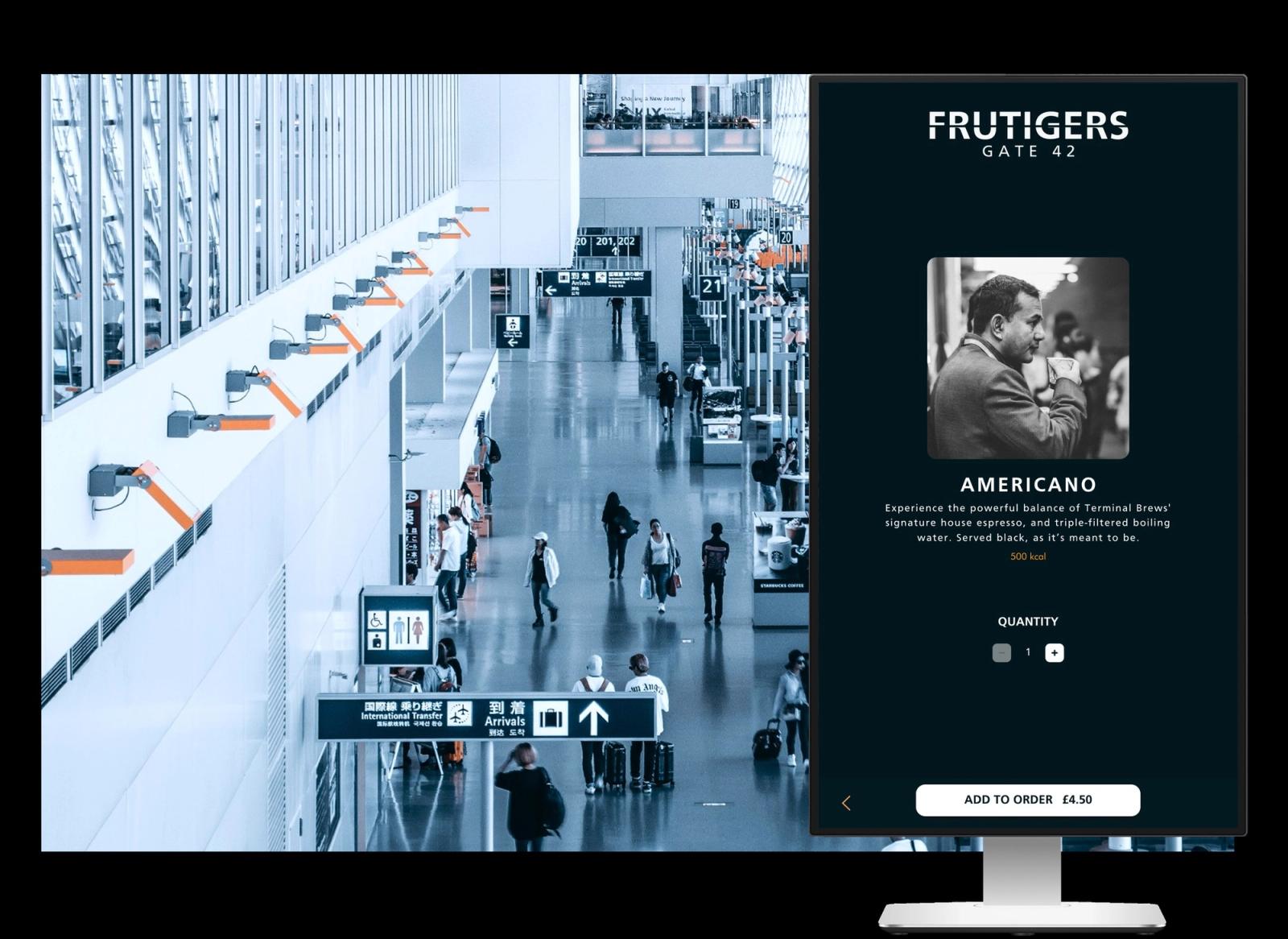
QikServe Kiosk
Brand-specific, accessible self-service ordering, built to hold up under real operational pressure across a platform operating in 42 countries.
- Client
- QikServe / Access Group
- Role
- Head of Product Design
- Timeframe
- 2020–2026
- Sector
- Hospitality technology
- queue time reduction
- up to 80%
- average transaction value
- +12–34%
- venue growth during my tenure
- 800 → 8,000+
- countries
- 42
- integrations
- 130+
- processed annually
- $1bn+
Forty screens and a client who never came
When I joined QikServe in June 2020 the kiosk was running on about forty screens. It would become the company's most critical product and the primary value point in the acquisition, and at that moment it was a very strong live-tested proof of concept and not much more.
The architecture underneath it was good. QikServe's core skill was enterprise software, well architected, built to scale. But they tended to build as if they were a dev shop for a particular client rather than building products for customers. That first version of the kiosk was built for one client, and that client never followed through. They never deployed. Part of the reason was that it was not operationally robust enough. It had not really been built for deployments.
Preoday, which QikServe had acquired shortly before I arrived, had never worked that way. They were building a product for multiple customers, and every customer made it better for every other customer. That difference in instinct, client work against product work, is the story of the next six years.
You could see it in the interface. The kiosk laid out menu choices in a stepped manner: you picked an item from a scrolled menu, then worked through a series of pop-ups for the choices attached to it. What it was doing was taking menu information out of a POS system and presenting it. Not reinterpreting it, not restructuring it. The only reference it had was the POS screen, which generally shows all your options at once even when they are layered, and it simplified that down into pop-ups. A POS screen of, say, twenty options became four or five pop-ups with four or five options each.
That was a capability other software did not have at the time. It also meant the kiosk was showing guests a menu that had been designed for staff.
Configurable, not customised
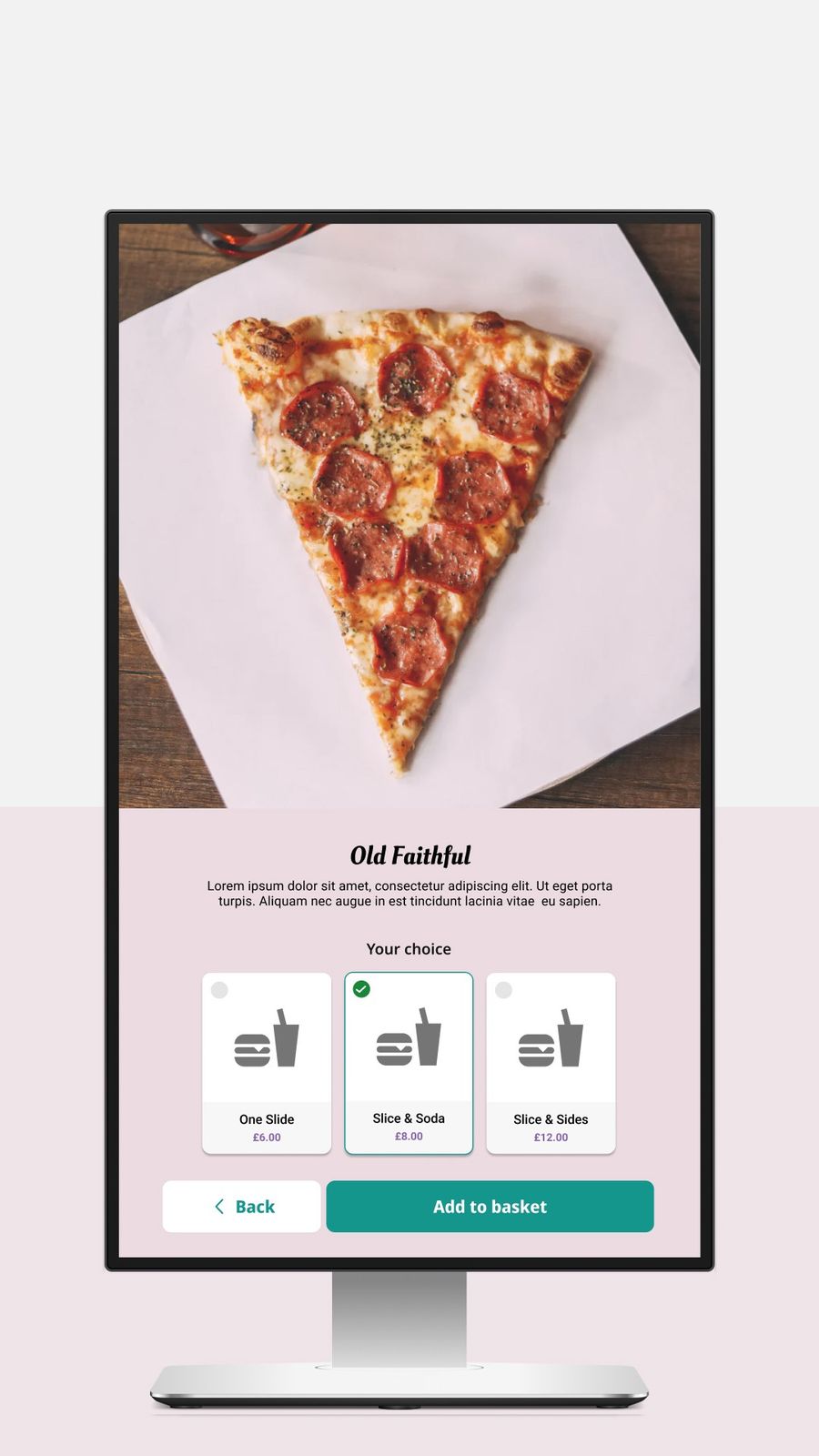
We won a piece of work for Burger King. The default approach in product management at the time was to hard code a new version for their requirements and their brand.
Enterprise branding is where I had come from, so I pushed the other way and carried the stakeholders with it: build something configurable rather than customise the product again.
That was the change. From that moment on we really had a multi-brand product, and it could scale in a way it never could before. Configurability is what allowed us to develop professional services from it. It let us deploy faster. We built tools so the customer success team and the engineers could configure without a designer or a developer in the room. Because we were selling to enterprise clients, we could afford for our own teams to do that work.
The cost is worth stating plainly. Those configuration tools stayed internal. With more money and resource we would have built them as customer-facing tools and let operators configure for themselves. That was a different matter and it was beyond any of our control.
By the end the product was multi menu, multi brand, multi language, multi currency, integrated, robust and offline capable, running across a global estate of more than 8,000 locations in 42 countries against over 130 integrations.
What the kiosk was actually being asked to do
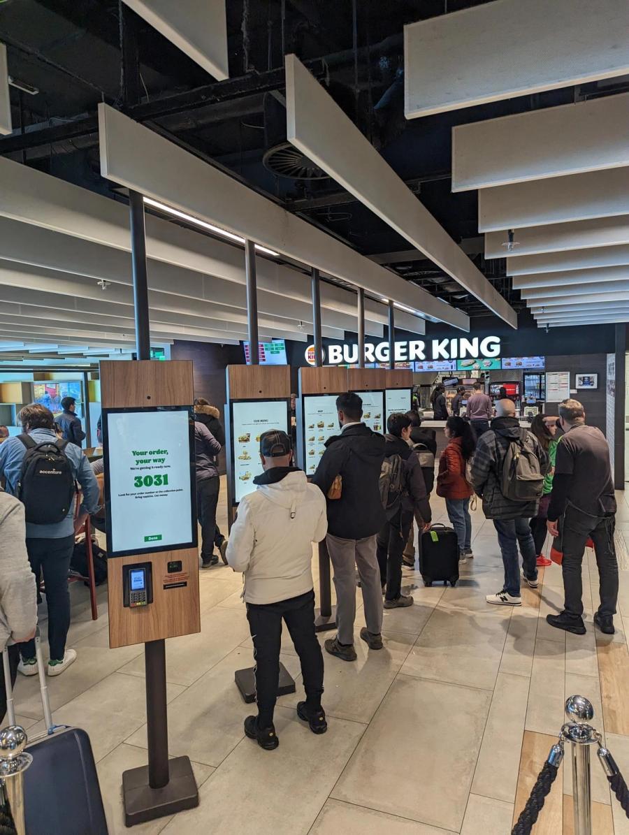
The kiosk was built as a queue buster. That was it, the original function. That is how everybody thought of them, ours and everyone else's.
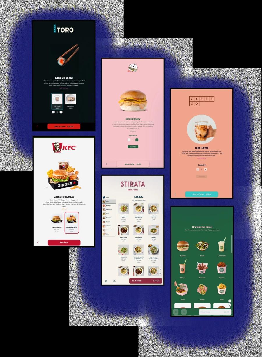
Then the commercial goal changed, and so did the expectation from the guest's side. The target became full digital transformation, and staff replacement. That is a much bigger job. The kiosk had to communicate, it had to guide, it had to educate. And it had to translate POS menus, which are built for staff, and even today are still built for staff. Almost nobody builds a separate menu for the guest.
POS systems are built to limit that translation. They do not offer full, easy APIs. And even where a POS is very open, or where the POS and the kiosk are built hand in hand, there is a fundamental difference between what a trained member of staff can do and what a guest can do, or is willing to do.
Go up to a counter and you know you want a latte and a muffin. That is what you go up for. The member of staff might recognise you, which changes everything, but even if they do not, they can understand what you have asked for. They can fill in the gaps in your order. They can ask you about it. They can get a sense of who you are. Are you in a rush or not. Have you been looking at the cabinet. They can read a huge amount, and they have scripts for the upsell. It makes for a low stress experience for the guest and a commercially successful one for the business.
When the guest has to do all of that themselves, the information overload is enormous. They are in the same store, seeing the same adverts, which is already taking up cognition. They are working out where to go: which of these are the kiosks, or do I queue for a person if I still have that choice.
Then they start the order, and the kiosk almost invariably puts something in front of the thing they came in for. They wanted a latte and a blueberry muffin. Their first thought is not to declare whether they are eating in or taking out. They are not thinking about logging into loyalty before they have ordered. They are not thinking about swiping through adverts, or allergen disclaimers. Even guests who do have allergen requirements, in our experience, still tended to place the order first and identify the allergen at item level or at the end.
And the commercial views overlap and overwhelm the guest. Somebody from legal and compliance wants the allergen check first. Somebody from marketing wants loyalty to be the first port of call. So the kiosk has to carry all of those business requirements and still deliver better commercial outcomes, through a more impacted journey, with the guest wading through every choice.
They came in for a latte and a muffin. Then they scroll the menu. Is their drink in favourites, is it in hot drinks, is it in seasonal, is there a search button. They look at pictures of every kind of latte. They repeat all of it for the second item. Then they review the basket. Then they trigger the payment, which the member of staff would have done. Then they deal with the receipt, which the member of staff would have done. Then they work out the fulfilment: collect at the counter, or wait for a name, which the member of staff would have done.
The sharp edges
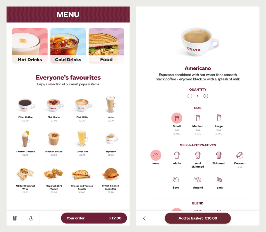
Complex cases were designed as first-class parts of the product rather than afterthoughts. Coffee customisation deep enough for any order, pizza builds from scratch, tipping, charity donation and age verification for alcohol each had a defined pattern, so adding one to a deployment did not break the rest of the experience. Alcohol was the sharpest of them: an unattended surface selling an age-restricted product across jurisdictions with different rules has no room for an ambiguous state.
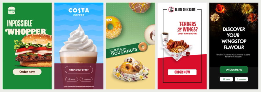
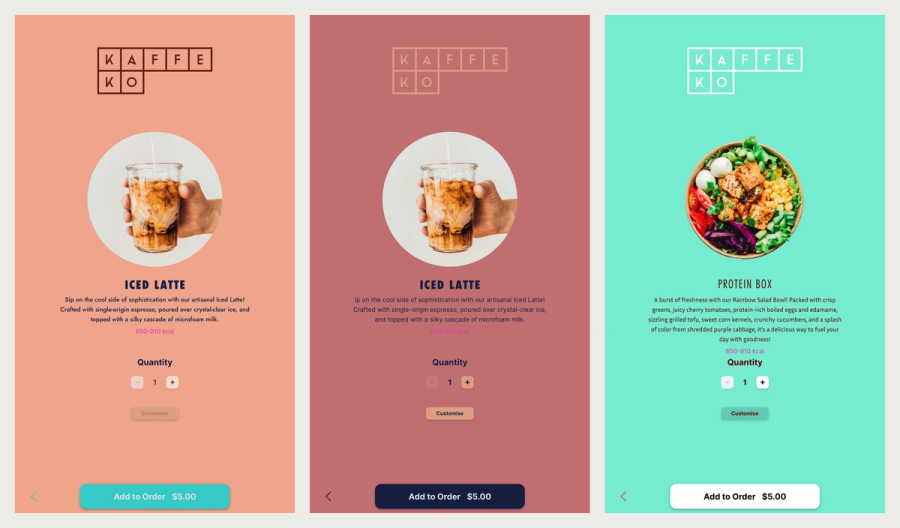
The attract screen earned its own attention. It is the only moment the kiosk gets to sell itself, and the difference between a screen that invites a first-time user and one that intimidates them shows up in adoption. We built a template system for it, portrait and landscape, so brand teams could produce their own without breaking the journey underneath.
What compliance forced, and what we chose
Only one feature on that kiosk exists because a regulation demanded it.
WCAG gives you a set of standards, and they are well documented: contrast, touch points, the things that make software usable for people with permanent or temporary impairments. ADA is different. It is a federal act, and unlike WCAG it is not prescriptive when it comes to digital, with a few exceptions. One of the things that does come in is reach. It is fairly simplistic: they take an average wheelchair user's reach and mandate it. That ergonomic data determines the minimum and maximum heights the kiosk interaction can sit at.
So we had an accessibility mode on the kiosk, but it was really an accessible reach mode. It moved the interactive content into the bottom half of the screen. That was the only unique thing we were forced to do. The rest were things we were choosing to do.
The choice that mattered was what happened to the rest of the experience when that mode was on. The precedent at the time, in airport self check-in and elsewhere, was to change the interface altogether: bigger touch points, a different and much more simplistic UI. I rejected that. I wanted all users to have the same experience, the same menu options, the same loyalty information, whether the kiosk was using the whole screen or the interaction area had been reduced.
We designed from that viewpoint throughout, never as an end of pipe step. We did not build the product and then patch the gaps or run a contrast check at the end. It went further than reach: every screen carried one function and one call to action, so a guest never had to hold in their head where they were or what they were doing. That is a cognitive load decision and we treated it as an accessibility decision.
It also made the product convert better. That is usually how universal design works.
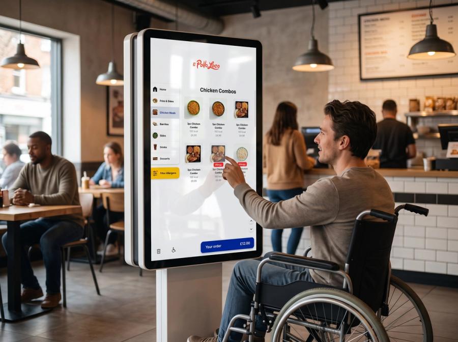
You did not have to go into accessibility mode to get an accessible kiosk. And if you were in accessibility mode, you did not have a lesser experience. The only difference was that we guaranteed everything was within a certain reach.
What moved
Every single time we put kiosks in, we saw queue times cut, sometimes by as much as eighty per cent. Average transaction value went up by between twelve and thirty-four per cent.
Those numbers came before any menu engineering or optimisation for digital. They came simply from letting guests order for themselves. Modifier choices went up with them, every time: a burger with more toppings, a coffee with more syrup, a meal and a dessert.
Individual interventions carried their own weight. Running the suggestive selling programme meant deploying a wide range of ethical and transparent, but nonetheless sophisticated, sales opportunities: cross-sell and upsell at item level, basket level and modifier level, bundles and meal deals, all held compatible across more than a dozen POS systems at once. One Burger King store made more than three thousand dollars in extra revenue in a single quarter, from surfacing sauces at the right moment.
Who made it
Those are the numbers. These are the people behind them. Nothing at this scale is designed alone, and I led design as Head of Product Design rather than doing it.
- Resources were scarce. QikServe was in turnaround, it took years to get out of that, and I had to push hard for every additional hire. So we hired for expertise, and we were very lucky to find Louis Wood, the first designer I hired: an exceptional talent and a phenomenal collaborator, and together we powered through work like very few people could. He took the version QikServe had built and restyled it for the modern era, building in the values and rules our operators needed to go through digital transformation properly. His work laid the foundations, not just for the product but for the company.
- Alexandre Nacari, who followed him. A fantastic all-rounder and a brilliant problem solver, the person you point at a tricky product problem, including the archaeological ones buried inside very old and very complex systems.
- Jagoda Malyszek, product designer, who specialised in the kiosk and maintained the design system as we expanded its capabilities enormously.
- Caio Ricci, Head of Engineering, and Ronaldo Zanoni, Lead Engineer, who made configurable behaviour real against more than 130 integrations.
- Chris Timms, Head of Product Management, who carried operator reality into every prioritisation call.
- The operators and their floor staff, who stress-tested every release on a live shop floor and told us the truth about it.
Diogo Matheus, product designer, who worked on the operator tools behind it: the dashboard, menu management and the rest of the back office.
Caffè Nero did not want a kiosk
Caffè Nero was so popular in airports that the demand was enormous, and airports were mandating kiosks at every food and beverage unit. The kiosk was essentially forced on them.
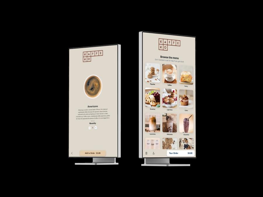
I was fortunate enough to design, present and win a kiosk that I felt understood their origins: their dedication to the Italian espresso bar, their heritage, their ethos, what mattered to them, and how we could interpret that into a digital experience.
Their team were excellent to work with, then and later. They never crowded the digital experience with short term commercial demands, and they never expected their guests to do the hard work. That was our job. It was the kiosk's job to do the hard work, and the online ordering's job, and we were proud to be able to do it.
That is the argument for configurability, made by a client rather than by me. Most brand guidelines will give you colour, shape and logo handling. Very few tell you what the experience should feel like, or what somebody standing in front of the screen should feel. Getting that right for a brand, at scale, inside one product, was the work.
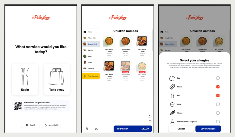
The kiosk was also the front door to a professional services practice, which launched formally a couple of years after the Caffè Nero work with El Pollo Loco. Enterprise deployments came with brand consultation and digital transformation work attached: translating brand guidelines into working systems, advising operators on menu structure and attract screen strategy, and carrying estates through go-live. I worked as a senior brand and digital transformation partner to enterprise clients including Burger King, Starbucks, Costa, Krispy Kreme and Avolta.
The thing nobody notices
Ask me what I am proudest of in that product and it is not anything a guest would consciously see.
It is that every element of every kiosk screen was accessible, and that we made that universal rather than optional. A single screen for a single function. Our experience showed that it made a better experience for all users and drove stronger business outcomes at the same time.
And it changed the company. QikServe became a business that understood accessibility and advocated for it.
A kiosk is really a fantastic piece of accessibility technology. We have seen it let people order who could not otherwise order without very personal assistance. The environments we build disable people. With a kiosk, we have the chance to overcome that.
Stack and approach
Figma with a token-driven theming model, a component library built for operator configuration, attract screen template systems in portrait and landscape, WCAG and ADA conformance work, and integration design across POS, payment and loyalty providers.
What I would do differently
The configuration tools stayed internal, and that was the right call. Self-onboarding needed money we did not have, and our enterprise customers did not want it. They wanted white glove, and most of them needed it: they had nobody who could do this work, and the few who did had no experience of digital hospitality or of what a kiosk actually demands. So the designer in the room was me. Samantha Backhouse and I translated the brand and took each customer through the transformation, one at a time.
What I would change is the commercial structure around that service. We were delivering professional services and treating them as an implementation detail rather than a product with its own shape. Clearer costs and clearer engagement structures would have let that practice develop properly instead of being absorbed into every deal.
I would also have shown customers far more of it. They often did not know what was configurable or what the options were, so they could not be part of configuring the product even where they wanted to be. That one needed education rather than budget, which is why it still bothers me.