QikServe Online Ordering
Mobile ordering across 8,000+ venues, on a platform operating in 42 countries, with accessibility built into the components rather than bolted on.
- Client
- QikServe / Access Group
- Role
- Head of Product Design
- Timeframe
- 2020–2026
- Sector
- Hospitality technology
- accessibility standard
- WCAG 2.1 AA
- locations on platform
- 8,000+
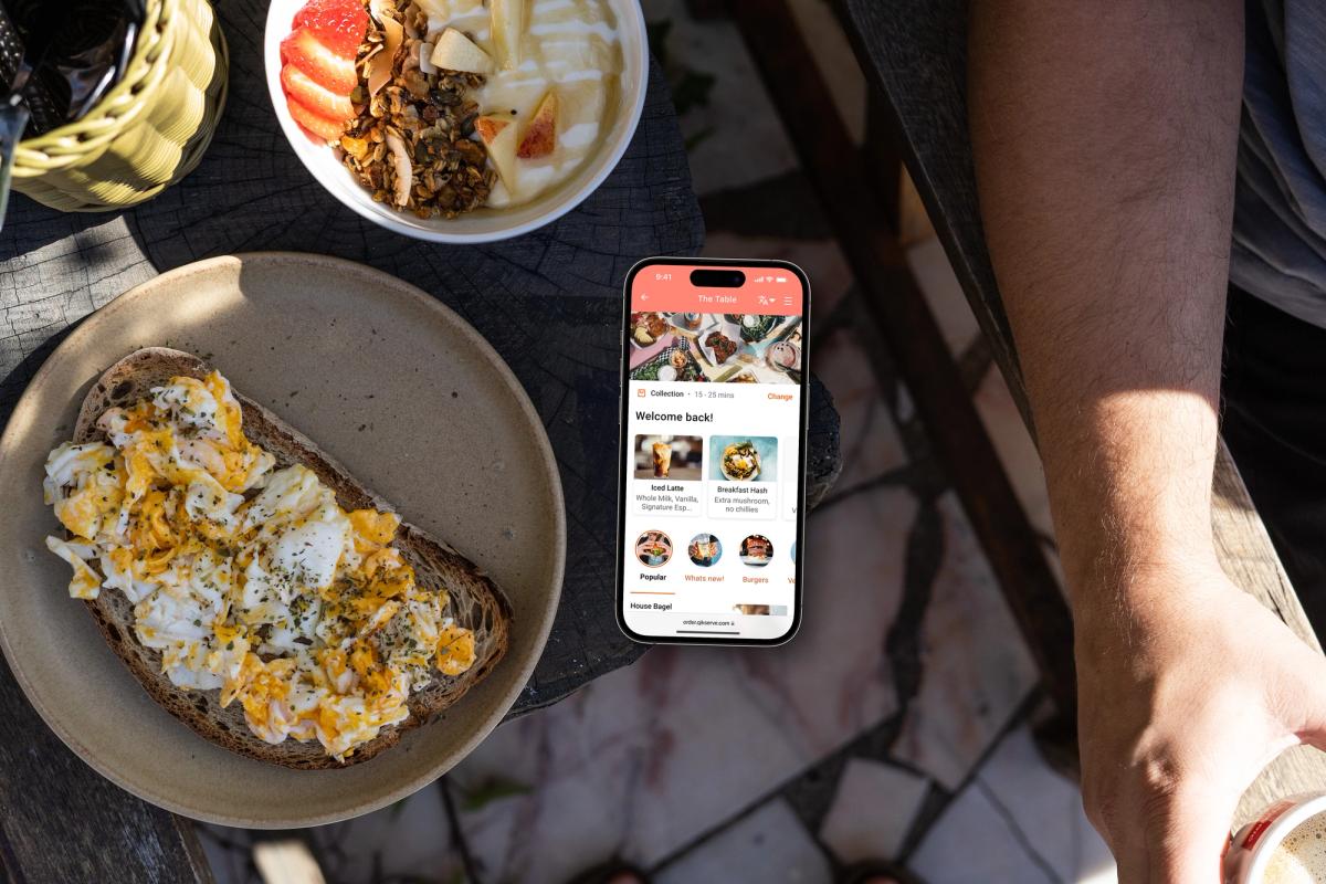
Online ordering was the web counterpart to the kiosk: the guest-facing ecommerce surface for hospitality brands, covering collection, delivery, configurable menus, payments, loyalty and location selection. I led its design at QikServe and then Access Group, on the same platform as the kiosk. Hospitality does not behave the way retail does, and that gap is where the design work lives.
I joined in June 2020, post-acquisition and mid-lockdown, with dining rooms closed by law and takeaway suddenly the only trade an operator had. Online ordering went from a channel to the channel overnight. The product was scaling as it never had before while its customers failed left, right and centre, and for a stretch we were giving it away to help operators stay in business. There was no roadmap. There was just survival. Some days this surface was the whole restaurant, and every design decision was made knowing that.
Menus are not catalogues
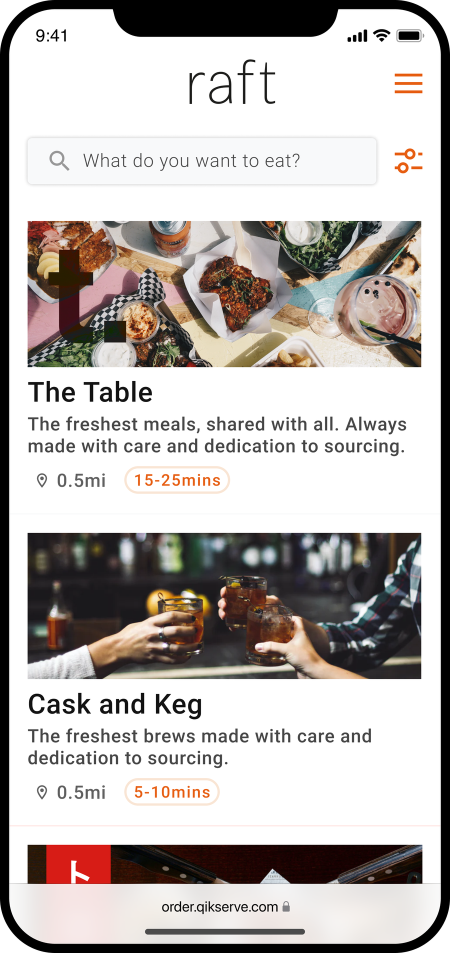
A retail catalogue is a list of things that exist. A menu is a set of promises that shift with time of day, kitchen capacity, stock levels and allergen data, and every operator structures those promises differently. A burger isn't a product. It's a decision tree of modifiers, swaps, exclusions and dietary flags, and the tree changes by venue, by daypart, sometimes by what the kitchen ran out of an hour ago.
So the menu architecture had to absorb that complexity rather than expose it. The guest should move through choices that feel obvious. Underneath, the system juggled nested modifiers, availability windows, price deltas and per-operator cross-sell rules. Get that wrong and you see it within hours, in abandoned baskets and order tickets the kitchen can't make. Get it right and nobody notices anything at all, which is the point.
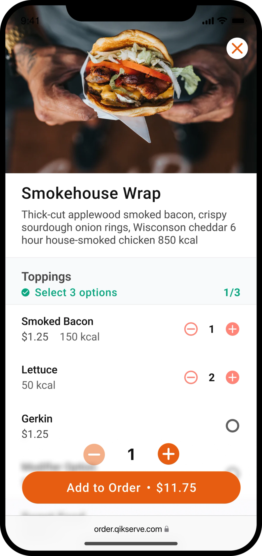
Location added another layer. A guest ordering from a multi-site estate needs the right menu for the right venue at the right time, with collection and delivery rules that match how that specific site actually operates. We designed location selection as a first-class step rather than a buried setting.
Conversion on a phone you don't control
Guests order on whatever phone they have, over whatever signal the venue allows. That ruled out anything precious. The flow had to be mobile-first and forgiving: predictable basket behaviour, obvious progress, and a checkout that holds trust at the moment card details go in.
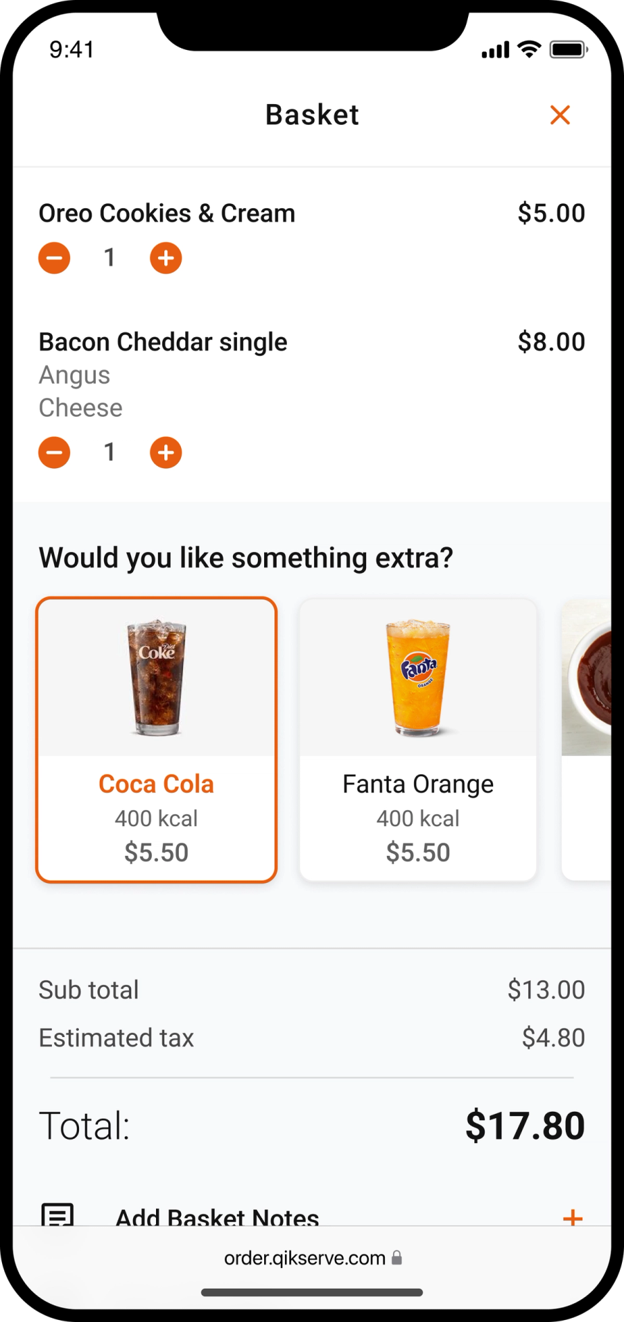
Payments ran through the platform's Stripe Connect integration. Cross-sell was built as a configurable pattern at item and basket level, so operators could lift order value without bolting friction onto the journey. I held one line throughout: a suggestion should help a guest finish their order well. The moment cross-sell feels like an ambush, you've traded a few pence of margin for the guest's trust in the whole flow, and you don't get that back.
What shipped
Over six years this grew from a single ordering site into an estate-wide capability.
- A menu system that carries nested modifiers, availability windows and dietary data without making the guest think about any of it
- Collection and delivery journeys with location selection built for multi-site estates
- Item-level and basket-level cross-sell as configurable patterns operators tune themselves
- Token-driven brand theming, so one codebase serves a global brand and a single-site independent
- Stripe Connect payments, with digital wallets where guests expect them
- WCAG 2.1 AA conformance built into the base components rather than patched on afterwards
Accessibility as a commercial argument
I never argued for accessibility as a compliance exercise, though the legal requirement is real. I argued for it as conversion. A guest who can't read low-contrast text, operate a fiddly quantity stepper, or get through checkout with a screen reader is a lost order. Multiply that across thousands of locations and the numbers make the case on their own.
Building WCAG 2.1 AA into the component layer meant operators couldn't accidentally configure it away. Brand theming could change colour, type and tone of voice, but contrast ratios, focus states and touch targets held underneath, whatever palette arrived.
Team and credits
This was years of effort across two countries and a lot of time zones.
- The product design team, who owned journeys, components and the theming system
- Platform engineering, who made configurable design actually configure across the whole estate
- Product management, who balanced operator demands against a coherent roadmap
- Payments and integration engineers, who kept Stripe Connect and 130+ integrations honest at volume
- Customer success and the operators themselves, whose menus and margins were the sharpest design critique we had
What it taught me
Constraint is the whole job. Brand, accessibility, menu complexity and device chaos all push against conversion, and the craft is treating them as inputs rather than obstacles. Every time we tried to shortcut one of them, the numbers told on us within a release or two.
It also confirmed the platform instinct I've carried since: solve the hard case once, in the system, and every brand on the platform inherits the answer. One configurable flow, many brands, no bespoke debt. That discipline came from the kiosk work, paid off again here, and it's the same thinking I now point at everything I build.