Quarters
The Brotique's store, rebranded and rebuilt around a simpler question: who does the work of deciding what you should buy?
- Client
- Quarters
- Timeframe
- 2017
At the time, looking at sustainable products, there was a gap in the whole market. You would read something like Esquire, and you would have these fantastic products, but there was still so much wading through what you should buy, what was the right thing. I believed then and I believe now that there was space for a company who did that work for you.
The Brotique could not be that company, and the reasons were stacking up.
The name was both the blessing and the curse. It was memorable, fun, engaging. But people took a perception from it that I didn't intend. It was supposed to be more a matter of fraternity and belonging. But people hear the word bro, and that was starting to develop negative connotations then. BuzzFeed picked it up.
The strongest revenue in the business was gifting. It was partially successful, especially the gifting, as I say. But when we produced our own products, they didn't develop their own brand equity or recognition. And the way I ran it was that it was always setting up new ideas and projects, so it was natural to try something different.
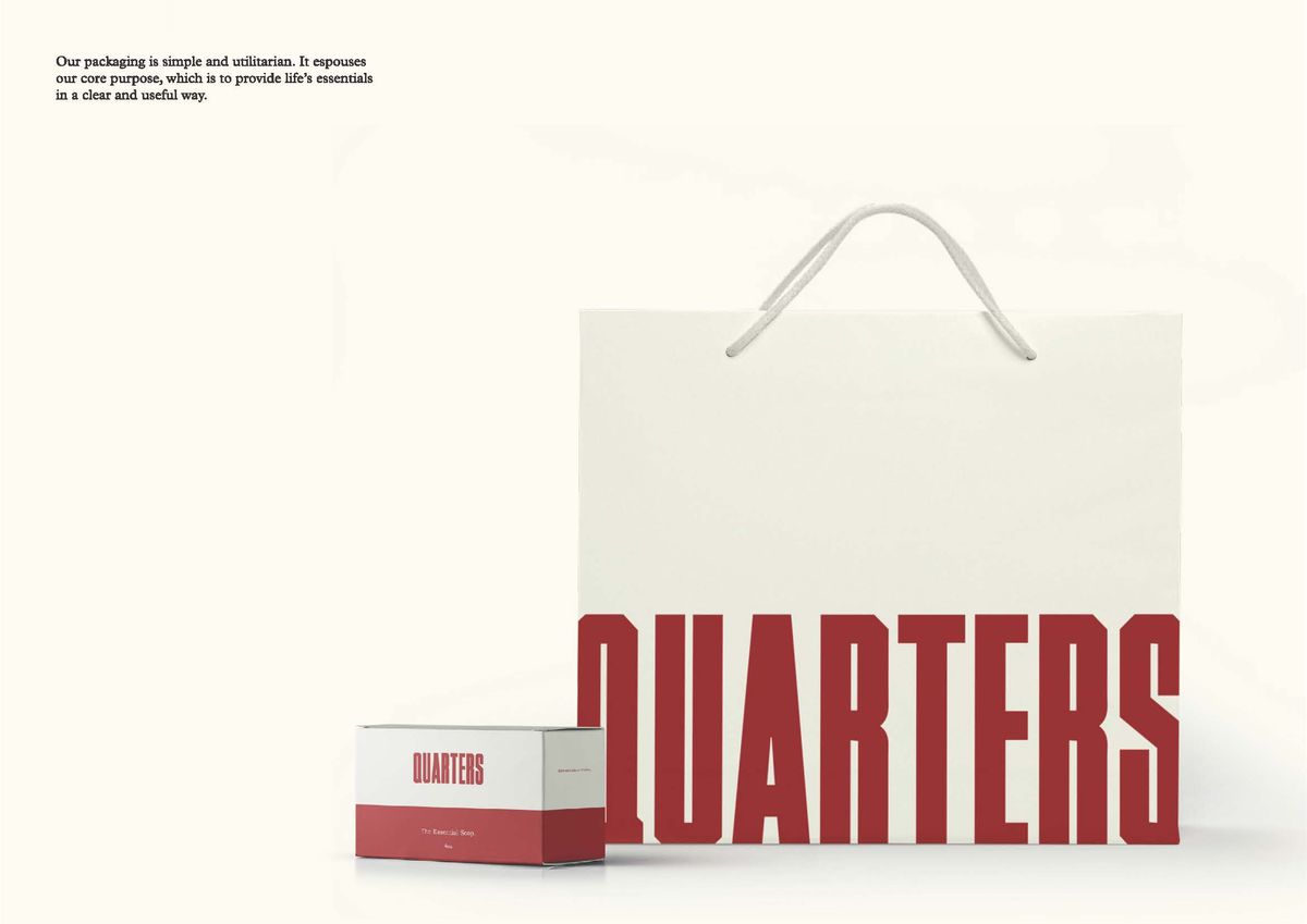
Then there was the thing we used to do that was doing too much for the business. We were trying to be very ethical in our sourcing, even our packaging. We had developed and introduced a concept called raw retail, where we would work right through the supply chain to minimise packaging. We had worked too hard for that to leave it sitting underneath a name that was fighting a different battle.
So Quarters was where that went. The design ethos, the more pure curatorial approach, the sustainability. I have always been inspired by the book Cradle to Cradle. We were really trying to find and source and manufacture products which would fit into the buy it once category. Timeless. Well crafted. Sustainable as well, because they would be cherished and would become part of the fabric of everyday life.
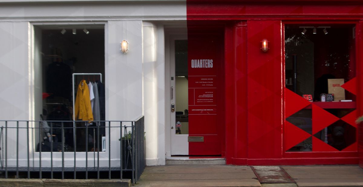
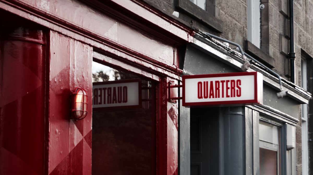
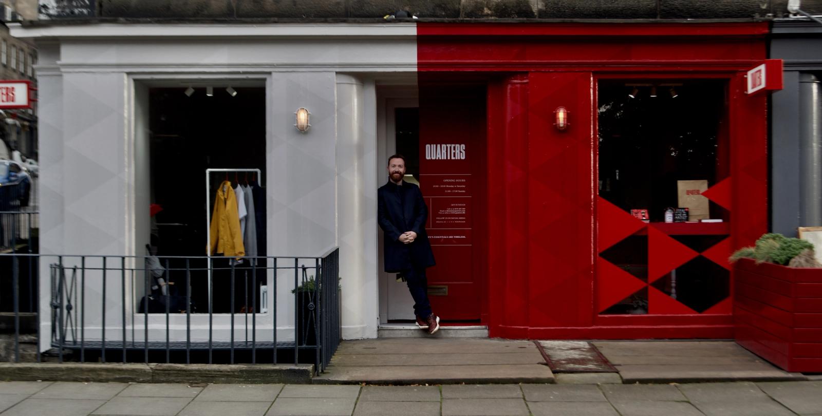
It also let us separate the business. The Queen Street store became Quarters. The Brotique carried on online. One to become lighter and lean further into itself, and to hedge our bets: if The Brotique name continued to attract attention that wasn't positive, we needed to be able to move on from it.
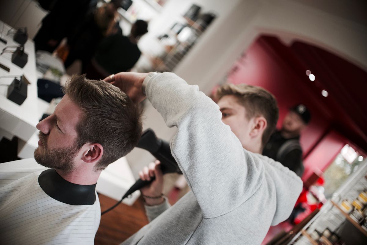
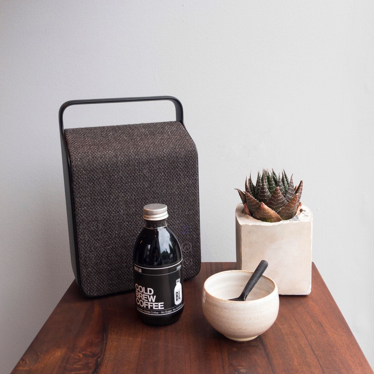
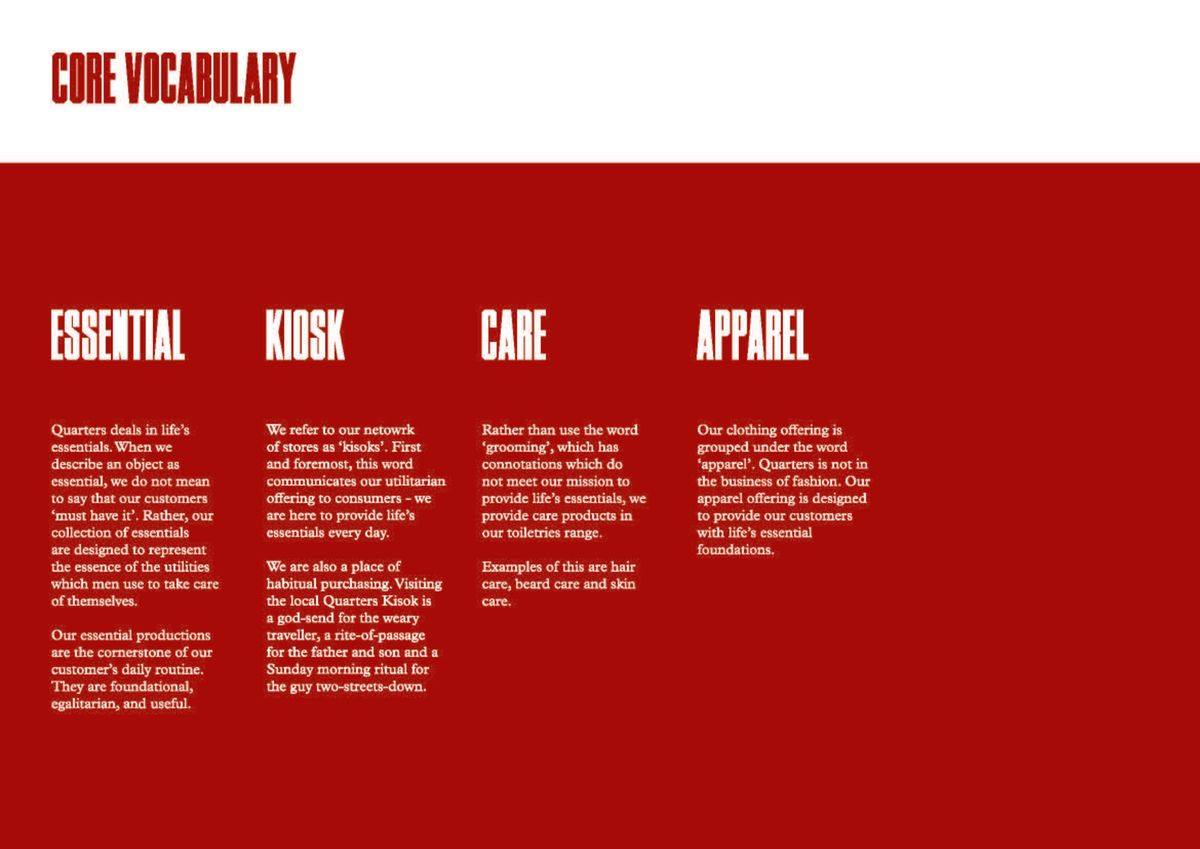
The name came from gentleman's quarters, deliberately shortened so that it did not belong to men only. And there were four of them: the barber, the cafe, the products, and the advice. We put the cafe in to make the place more of a daily touch point, and started building out an expansion plan for more stores in a smaller format.
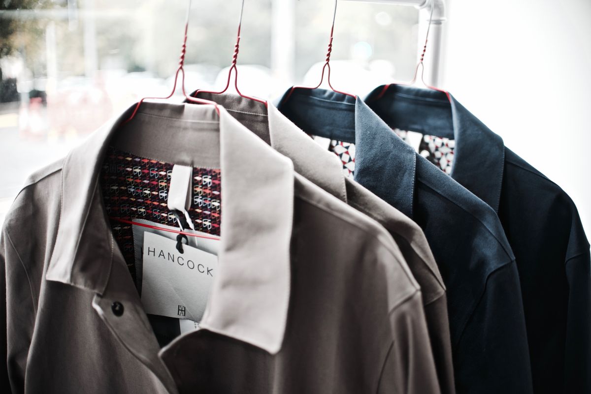
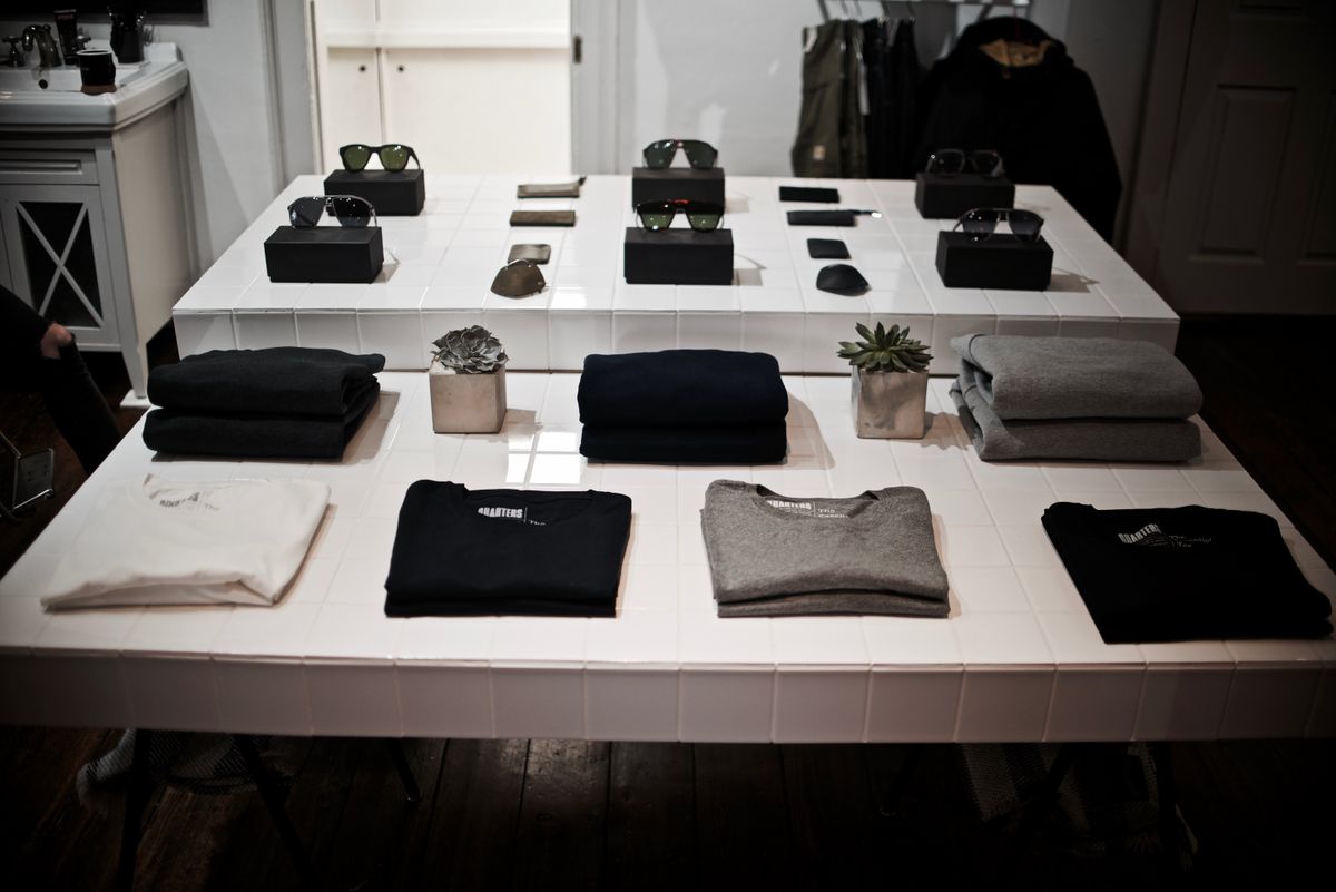
It traded. It sold grooming, apparel, accessories and home, from makers like Garbstore, King and Tuckfield, Brixton and Jollies, alongside our own products and the Hudson and Armitage beard oils. Then in 2018 we sold the business on.